The culling begins with the comments section. On Christine Dacera’s death, the weaponization of social media, the sensationalism of false justice, and lessons we have yet to learn.
During the New Year, Christine Dacera’s coworker Rommel Galida woke up at 10AM. He found her deep asleep in their hotel room’s bathtub, passed out from a New Year’s Eve party they attended together with other friends the night prior. He put a blanket over her and returned to bed, waking up a few hours later to see her fully unconscious and turning blue.
Rushed to the hospital, Christine was quickly declared dead. Autopsy pending and investigation underway, the case reached mass attention as the eleven men with her were named suspects. Immediately, the Philippine National Police arrested three of them – including Rommel – charged of rape-slay (rape and homicide); the others still at large.
(The Philippines is the only country that uses the term rape-slay.)
“This is a fair warning. Surrender within seventy-two (72) hours or we will hunt you down using force if necessary.”
Philippine National Police Chief Gen. Debold Sinas
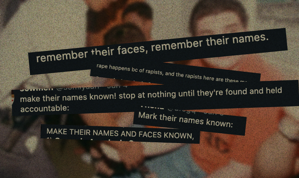
With her companion’s names lined up, the nation turned. The act of desecration is an easy one if given the backing. This case was perfect: it came with the new year with everyone at home and hyperfocused on the next public case that would become dinner table conversation, resurfaced the deeply-rooted misogyny and sexism often tabled, and Christine was so human. She was a graduate of the country’s most prestigious university, worked a dream job, died far too young, and like any other victim – was completely undeserving of her fate.

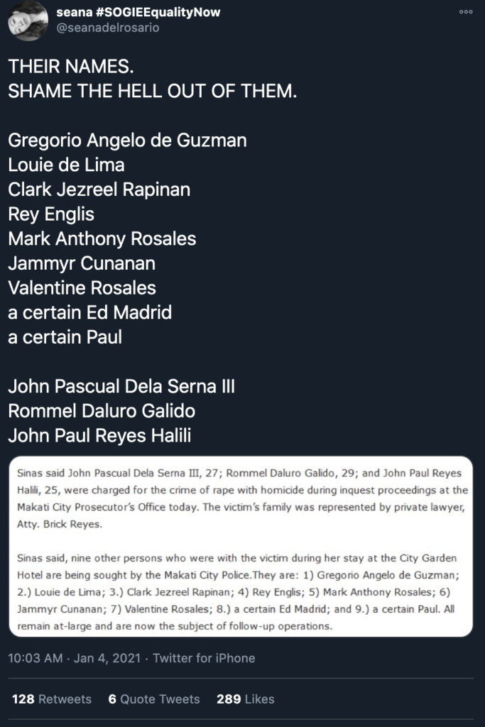
Denouncing these names and declaring them enemies of the nation, online civilians took to poor discourse about rape culture (the hashtag of choice for Christine was #ProtectDrunkGirls, which is problematic in its own right; if not this, then #NoMeansNo repetitions), shitty ad-filled clickfarms publicizing the same paragraph about Rommel Galida’s entire work history, and the passed Christine amassing over a hundred thousand Instagram followers.
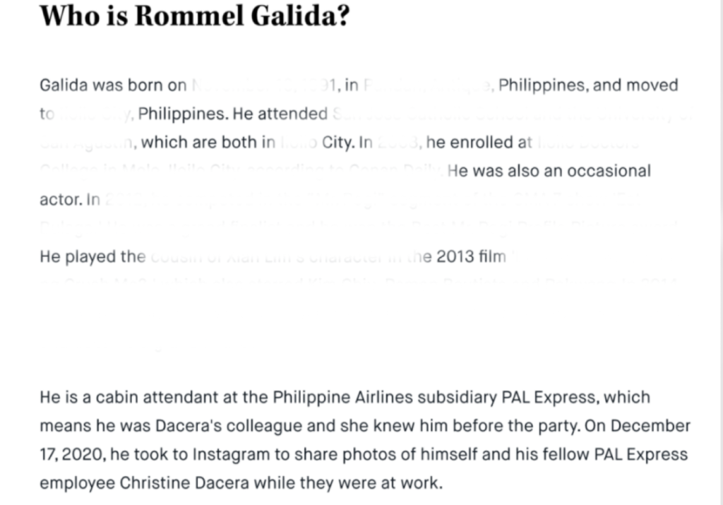

Each article and hastily-written post shared over and over with “CTTO/credits to the owner”, her being memorialized alongside Facebook caption screenshots, reduced and condensed with each share.
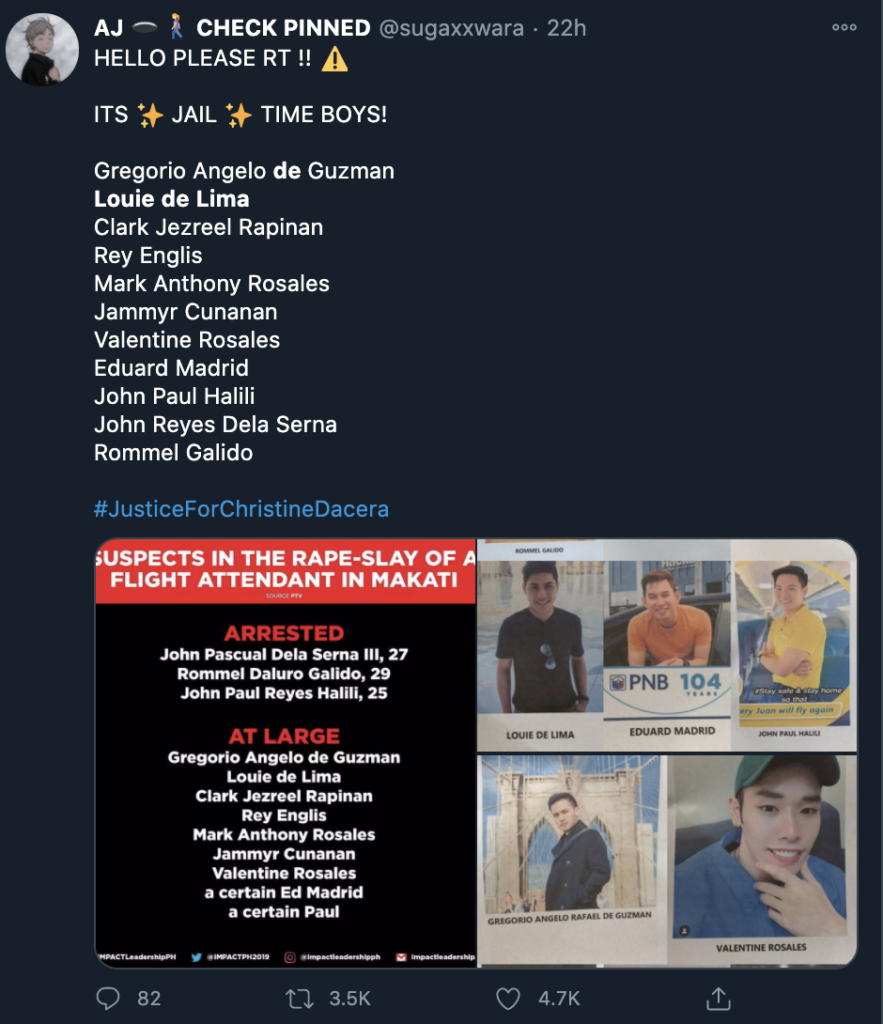
In the Name of Justice
The Philippines is a nation swayed by men throwing money at us across variety shows, smoothtalkers and dramatics no different on the television than in make-believe radio courtrooms, and morning news filled with celebrity chatter.
Political partylist ACT-CIS also added onto the witchhunt, promising a Php100,000 bounty for any tips that people could share. ACT-CIS has historically been linked to the sensationalist broadcaster Raffy Tulfo. Here, little acts of kindness like returning lost wallets are praised, and family disputes turn into entertainment for the masses. Tulfo screams and curses at the poor in scenarios where there really is no suspect, only victims, mass entertainment more than any form of rationality.
What release broadcast media provides is immediacy. This is why Filipinos tag Tulfo onto cases, throw away arguments with “Isumbong mo yan kay Tulfo“, and place their notions of justice in the hands of a cursing celebrity with the power of trial by the public. No – in Tulfo’s world, public school teachers are perhaps given more scolding than failing policemen. What Tulfo demands is action in the present, providing ultimatums for whoever can’t present themselves in radio to millions of listening Filipinos. He still dangles the threat of charges and police intervention, results that could not have come from the people who go to him since of course, they are common folk who will not be listened to. To Tulfo it goes. Katiwalian, kassamaan, at kalokohan! They swear to fight against.
The same kind of immediacy is why Rodrigo Duterte has rose in popularity. Our country’s cycle of populism is too predictable as his vigilante-style, state-sponsored death squads soothe the most vulnerable into a feigned sense of safety –– until they themselves are the victims. The spectacles of Tulfo justice and Duterte’s wrath are no different from each other, really; yet, clueless, bored teenagers and workers claw at the first opportunity to become who they detest most. Social media becomes vehicle to enact our own kind of decree: humiliating and harassing the family of each victim, digging through their history and offering no sense of reprieve. We become our own arbiters of justice, often masked through anonymous accounts and the flood of rage.
Lessons from the Boston Bombing
In April 2013, 3 were killed and 264 more injured in a bomb blast close to the Boston Marathon finish line. Memorials sprung along the streets, exhibitions of running shoes marked with the names of the runners were stacked together before yellow trim, and the world cried in solidarity.
Three days after the bombing, the FBI released images of two suspects. Grieving and shock turned into vitriol, silent solidarity turned into a hunger for action and revenge. This becomes near-ritualistic after any mass disaster: seek the villain, latch on, and destroy them.
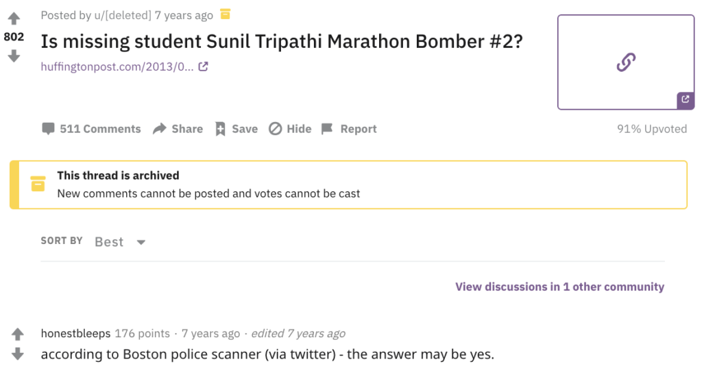
Brown University student Sunil Tripathy had gone missing a month prior to the bombing, pausing college due to a long history with depression. His family put together photos, callouts, and messages on a Help Us Find Sunil Tripathi page. At the same time, /r/findbostonbombers sprouted on Reddit, anonymous usernames plowing over missing person pages and public directories to take their own investigative path. With a seven rule spreadsheet embossed with “DO NOT POST PERSONAL INFORMATION” as the most important one. With thousands of ears pressed to Boston police scanners and any ounce of speculation, Sunil’s name was mistakenly tweeted out as Boston Bomber Suspect #2.

With the early revelation, social media became a victor. It had solved the case and identified the victim before any news outlet, emerging winner as the tug-of-war of media. Politician Greg Hughes, as primary Twitter spreader, lauded the swathe of anonymous detectives: “If Sunil Tripathi did indeed commit this #BostonBombing, Reddit has scored a significant, game-changing victory. Journalism students take note: tonight, the best reporting was crowdsourced, digital and done by bystanders. #Watertown.” More journalists retweeted the claims, further spreading the unverified accusation against a missing, suicidal student.
On April 23rd, Sunil’s body was found in Seekonk, near Providence Rhode Island. He had committed suicide.
Sunil was most visible case of misidentification and mob outrage, but far from the only one.
In the Name of Christine
The act of misdirected anger after mass disaster is not new. 9/11 brought the world over to an unprecedented war on terror and waves of casual, racist brutality. Chinese-Filipinos born and raised in the country are spit on, isolated, and refused services after the wake of the Coronavirus; casual posts articulate the issue of “Mainlanders” in encounters at milk tea shops and condominium elevators in a country that believes it’s impossible to be racist.
Social media platforms have given us this sickly addicting taste at control. The words that seep into the public hegemony of course, come cherrypicked to whatever fits the hivemind most. These platforms also allow the darkest sides of our inhumanity to rise: mild inaccuracies and mistakes, if you don’t have the appropriate amount of social capital to back you, are left as permanent marks. In cases like Tripathi’s, even unnecessary death sentences.
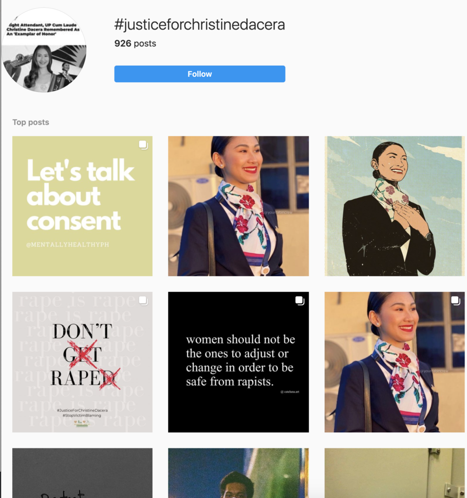
Christine is loved, but this act of love and grieving has implicated friends desperately defending themselves against new revelations: Christine’s death was ruled to be of a sudden aneurysm, lacerations and marks on her body as natural results from sex from days prior (the way people discuss her personal relationships are another issue). Information about the gathering she was attending actually being a gay party (many of whom in the community fear public outing), testimonies from her friends ignored in public discourse.
“Paano po naging rape? Bakla po ako. Never po ako nakipagtalik sa babae ever in my life.”
Translation. How did it become rape? I am gay. I never had sex with any woman ever in my life.
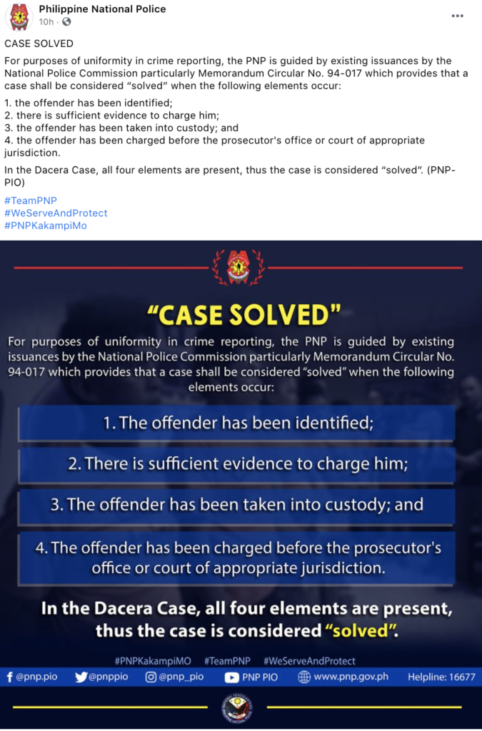
The Philippine National Police declared the case as solved while suspects were still missing, enumerating a loose four-element list before ending the post with #WeServeAndProtect. Here, they painted themselves as the people’s victor too, and an ally in a joint witchhunt.
Digging through the case, it’s fucking impossible to find any details of the investigation. Any other statement from the arrested victims is buried, or non-existent. Christine’s face, her friends’ faces, all the suspects names blur into one. Statements and ill-worded posts from random accounts dominate public discourse over news outlets and words from journalists, the spectacle crowning.

When Micahel Foucalt recounts public execution, he notes that they were more than just a mere act of justice – they were a “manifestation of force.” Public theater is grotesque, hypnotizing, and promised assurance and trust in the state; it worked as a public deterrent. Bodies hung on pikes, left on nooses, shot and bagged in cardboard at the side of the road, left pooled in Quezon City suburbs––they are all one and the same. Our collectivism calls this as more than an issue against Christine’s family, far more than personal matters. We’ve incurred the wrath of a nation: a sin against the state, of the people, of something so close to home. When we hang bodies dry with words in a hyperdigital society, how close are we to manifesting this rage into physical death itself––disproportionately affecting the poor?
The same weaponization is precisely what propelled Duterte to his victory in 2016. It’s what silences dinner table conversations, machoisms of the father distancing themselves from their left-wing children. It’s what propelled us to a senatorial slate in the 2019 midterms fully consisting of Duterte’s allies, including a daughter of a dictator, the President’s personal aide, and men who have surrendered on counts of graft and fraud. We’re facing a mass punishing, given a false sense of power when the social media spectacle truly only serves those already in authority. In the case of Christine Dacera, the outing of Dacera’s friends to hastily write off a case and turn the people to the police’s debt.

Master Sergeant Jonel Nuezca, and the Saviorism of the Philippine National Police
December 20th, just a few days before Christmas. A video circulates of a young girl with her off-duty father in a heated argument with some unarmed neighbors. Sonya Gregorio and Frank Gregorio were setting up rudimentary noisemakers, custom around the ritualistic Filipino Christmas practices. Sonya, 55, hugs her son – nestled on her lap as she attempts to prevent him from further fighting with then-officer Nuezca––bystanders are wailing, unable to intervene and in fear for their lives. Nuezca’s daughter further antagonizes the mother and son, yelling “my father is a cop.” Her phone up, face in blind apathy. He threatens the elderly Sonya, then shoots her and her son in the head –– continuing even while they were bleeding out on the ground.
Before the video’s events, neighbor Alyssa Calosing reported that Nuezca had already been physically assaulting Frank, hence his mother sheltering him and holding him back. Right after the incident, Jonel and his daughter walked –– motionless. Videographer stunned, empty, completely number. You can hear Jonel Nuezca faintly speak, “mission accomplished,” as he walks away.
Jonel murdered two innocent, unarmed neighbors in broad daylight –– uncaring of the crowd of people around him. Alone, this was far from his first act of malfeasance; Jonel had been previously charged with two homicide cases, acts around his neglect of duty, and was cleared of two killings in 2016 in a buy-and-bust operation; in alignment with Duterte’s rise to presidency and militant crusade against addicts. Kill them all.
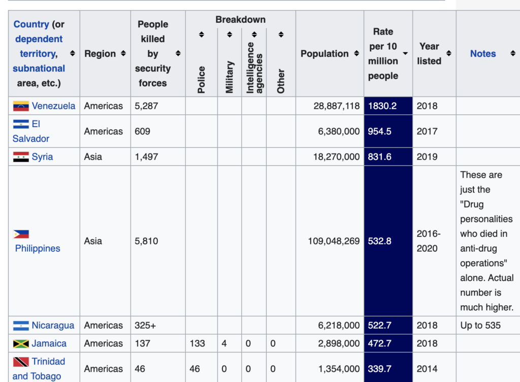
Over 7,000 people were killed in a six-month period at the start of Duterte’s drug war. The Philippines has the fourth-highest murder rate, adjusted for population. Isolated, we top the list.
While Duterte has denounced Jonel’s actions (of course, it was caught outright on tape), we remain desensitized to the onslaught of brutality, repression, and nauseating violence that has become commonplace in Philippine society. Instinct becomes to mob. Pathology is to seek justice. We circle around the idea of the death penalty since it’s the best way to measure death: living by centuries-old philosophies in the vein of Hammurabi now as we did in our imbalanced histories.
Misconduct still thrives. Like the discourse surfacing over rape culture in a patriarchal Philippines, we see trickles of blame shifting to victims (e.g. what clothes were you wearing?) that allow for larger violations––assault, rape, death. It takes pyramids about culture for a blinded nation to understand what the accumulation of fear can mean.
We idealize extreme cases where an individual can be implicated for the crimes of a larger society, forgetting that the larger picture of accountability looms and will simply allow for more slips and deaths to happen. That is, our sense of justice and hearts need to contain familiar stories, graphic videos, or an impending sense of that could be us for the common man to wish to act. Even when we do, we fail to detest the more productive part of the problem: the national phenomenons and systems that continue to let police bury murders under the rug and award themselves from it, the mob mentality against the Nuezca that can easily turn into death wishes to any sleight of hand. If he killed your mother, he deserves to die. It’s why the most Catholic, religiously devout country in Asia devote themselves to extremes––the abundance of suffering and poverty, the underpaid defending millionaires, the death penalty for the fellow poor––all as larger orchestrators of these systems go unscathed. The Filipino way is to kneel at the altar and thank god, while praying for justice in the most grotesque of ways.
…
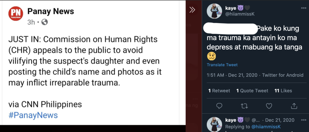
Jonel Nuezca’s daughter has her name publicized. A Twitter search away and people have debunked her entire educational history, her Facebook friend’s list, and the death threats that follow her. At twelve, people have put up fake Facebook pages of her, imitating her real Facebook account (which isn’t hard to find), her personal profile picture at nineteen thousand shares––detailing wishes for her to die. They share collages of her and her family, explicitly recounting how they wish for her mom to be assaulted, editing her photos and putting together YouTube videos parodying her.
In the same breath, liberals who had advocated for the raise of the minimum age of criminal responsibility exhale in relief, knowing that it still currently stands at twelve. They rejoice that she is covered.
Just like how other cop families are utterly deplorable for attempting to step in and say that their fathers are an exception, Jonel Nuezca’s daughter is victim of a broken system. This is not the first time her father has killed, not the first time his office will kill, and far from the first time that his force will in an age where they are Duterte’s pawns and heroes.
As the Commission of Human Rights begs for people to take down photos and names of the young girl, people are unrelentless. The witchhunt is the act. They care less about the fate of the victims or the power that enables these injustices to come into action over and over. They are magnificent in their act of vilification, of mimicking their President, of taking hand in the act of implication. In the end, they wipe their bloodstained hands away and deem him an outsider, get praise for the “good ones” in an industry where there should absolutely be no errors, and know they’re at peace––until the next.
…
We become no different from the murderers. Our trials only fuel the subtle, manipulative evil that we fear. Impassion pleas to act only brutalize the way for the next.
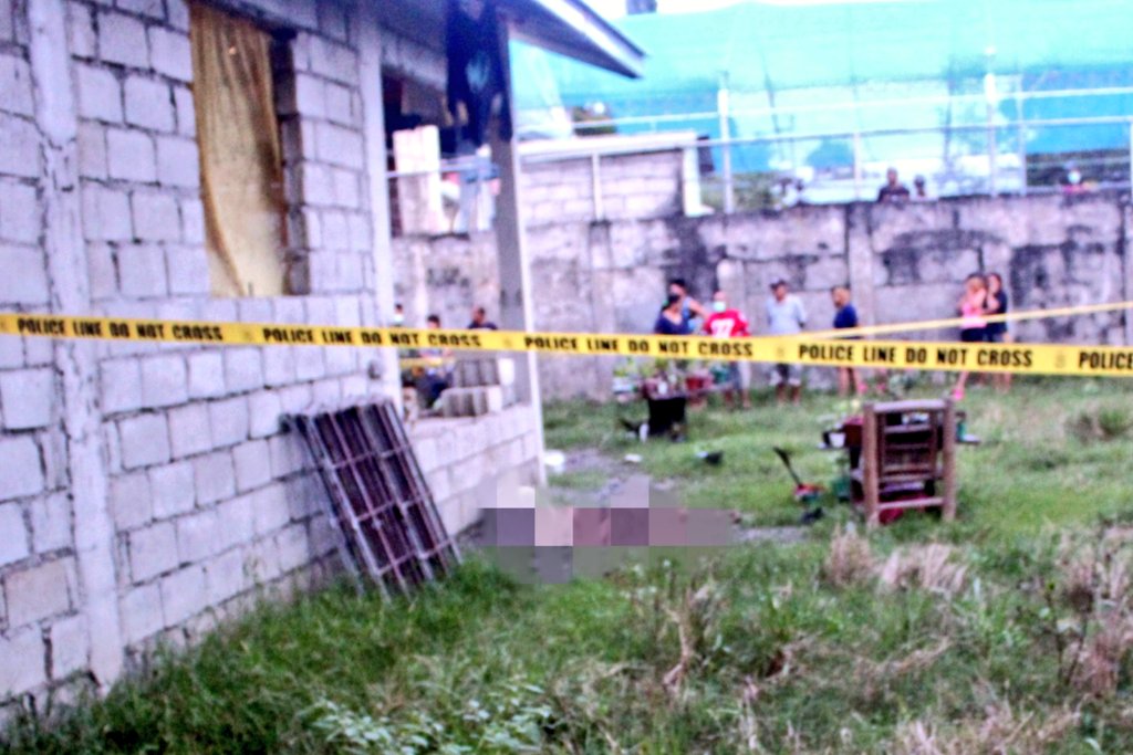
In the Philippines, collective memory is a weak, if not non-existent concept. We know this in many ways. We knew this when we marched to overthrow a dictator beginning February 22, 1986, then elected his daughter back into office three decades later. We know this because our justice runs on ads and broadcast dystopia that we allowed to fall with the death of ABS-CBN, and never question why petty thieves get worse sentences than politicians who steal millions from the country. We know this when Duterte is back in power, directly copying the tactics of a former dictator beginning with the assault, jailing, and killing of student journalists that fueled the insurrection. Christina Dacera’s death is now being used as a force to alienate the long-oppressed queer community in the country further, with no room for suspects to speak. They’re not even fucking doing any work on the investigation. The state is making themselves look good, faking autopsies and coaxing the masses to pull the trigger.
We forget the meaning of process. We want immediacy. We want blood, only. These desires are far from true justice. There are no winners.

I remember Fabel Pineda, fifteen-years-old and putting her faith in the police after already being molested by two cops until she was gunned down on the way home from a police station. Her story is less sensational than the Christine Dacera case, more hushed. I remember Myca Ulpina. I grit my teeth at how my mind can only contain so many names, at how we must dig for the stories of Rodesa Imat or Salem Tenebroso –– left in kill lists with only their names and ages to go by. Most of all, I remember Paco Larrañaga.
Outrage is what wins. Not correction or justice. It’s a game of feelings, movements, and of appeals. I’m all for calling out a friend who may have fucked up if only to question that line of thought, only if you exert a continuous effort to ensure that the justice served is deliberate, meaningful, and scaleable. I grew up in an internet that saved me with the promise of equality in voice, yet now only see it as a place where we are all pawns.
Until each statement is retracted and conscious effort is done to further verified advise, we only legitimize the PNP’s attempt at cover-ups. We become complicit in their half-assed investigation, serving no one but themselves. Like unretractable defamation, deleting tweets and shares is nothing –– we need an intentional commitment to furthering the truth and severing ourselves from blind emotions that jeopardize not only the safety of Christine’s family and friends, but all future Filipinos who could be next. Correct our words. Trace your shares. Know and own every word. Resist the Philippine spectacle that has long-enabled the state to wrap its finger around us.
When I speak against the killer, who hears it? When I wish death upon somebody, who lives? When I forget, who is left to remember?
Further reading
- What we know so far: The death of Christine Dacera, Rappler
A review of police statements on the death of Christine Dacera, linked to this post as of January 6, 3PM PHT. - The Chiong Murder Case
1997 trial where sisters Marijoy and Jacqueline Chiong were kidnapped, raped, and murderer. Paco Larranaga and six others were sentenced to the death penalty; he will be 61 years old when released. Larranaga’s guilt is strongly questioned and is investigated in the 2011 documentary Give Up Tomorrow. - On Tulfo Justice: Why Raffy Tulfo Means Justice for the Filipino Everyman, Ara Eugenio for the Reportr
On Jonel Nuezca and the easy, universal convenience of Tulfo-branded relief for the Filipino masses. - Collective memory making an urgent task for Filipinos, Clarissa Militante for Union of Catholic Asia News (yeah, I know)
On Duterte’s extension of martial law, mirroring the deeds of Ferdinand Marcos in the not-so-distant past - The Punishing of the Philippines
Another piece I wrote on digital extremism in the age of digital collapse in the Philippines. Tackles the shape of the internet, and dangerous radicalization.
